Our Blog
The Middle Kid of Lit
Middle grade sits awkwardly in the space between effortlessly adorable picture books for young children, and effortlessly trendy YA for teens. Maybe that’s why I enjoy writing it so much – because it reminds me of how I was at that age. I was a gawky, awkward kid with a nose that was growing too fast for my face, a mouth full of braces, and giant glasses that made me look like an even bigger dork than I already was. But much like the protagonists of many middle grade novels, I wasn’t yet jaded by the reality of life. I still believed in magic, and more importantly, I still believed in myself.
Posted by Tania del Rio
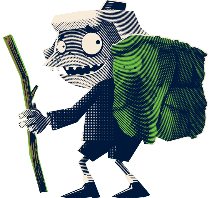
Will Staehle on Designing Warren the 13th
Photo Credit: Brandon Hill
Hey everyone! Will Staehle here, the creator and illustrator of Quirk’s Warren the 13th series. When I’m not busy working on Warren, I run a design studio, Unusual Co., out of Seattle. I’ve designed all sorts of fun things over the years, but the majority of my work continues to be in the world of book cover design. I’ve been really fortunate to have designed covers for some amazing authors, like Michael Crichton, Stephen King, Michael Chabon, V. E. Schwab, Ernest Cline, Andy Weir, Warren Ellis, Christopher Buckley, and so many more. I’ve never kept count, but I’d estimate that I’ve designed over a thousand covers so far in my career.
So you might assume that when it came time to design my very own book cover for Warren the 13th and the All-Seeing Eye, it would be my absolute dream project, and you would be 100 percent . . .
Wrong.
Posted by Will Staehle
The Truth Is Out There (In the Backyard!)
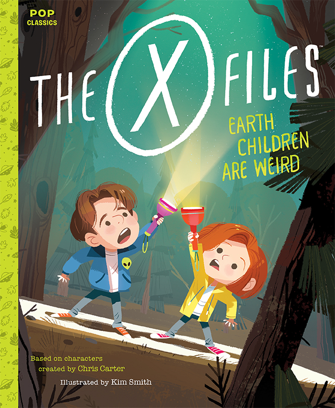
X-Files Illustrator Kim Smith Talks with Quirk Publisher Jason Rekulak
Quirk Books Publisher Jason Rekulak collaborated with illustrator Kim Smith on her best-selling picture book adaptation of Home Alone, and he was thrilled to re-team with her on an adaptation of The X-Files. They chatted recently about how this otherworldly picture book came together.
JR: Were you a fan of The X-Files as a kid?
KS: Growing up, I was obsessed with everything paranormal. I loved ghosts, aliens, any sort of unsolved mysteries. But I was just seven years old when The X-Files premiered, so I wasn’t allowed to watch the early episodes (because they would have given me nightmares!). Luckily, the show was a hit, so I did catch episodes in the later seasons during their first run.
JR: Any particular favorites?
KS: The episode I remember most was about a virus that made your head explode [“Drive,” Season 6, Episode 2; the episode was directed by Vince Gilligan and starred Bryan Cranston, who would later team up on Breaking Bad]. It stuck with me for years, and it was fun to see it again when I watched the series as an adult (thanks, Netflix!).
JR: How did you go about imagining/illustrating Dana Scully and Fox Mulder as children?
KS: I wanted to make sure you could identify them as the characters from the show, but I didn’t want them to resemble bobble-heads or mini-versions of the adult Dana and Fox. I wanted them to look like real kids. Their iconic hairstyles helped a lot. I also gave Fox an alien pin to show his love of the paranormal. (I wanted to squeeze an “I Want to Believe” poster into one of the illustrations, but I could never find the right place.)

Early character sketches of Fox Mulder (top) and Dana Scully (below).
JR: Can you tell us a little about your process?
KS: Once I have a final manuscript and approved character designs, I start a series of rough thumbnails. They’re small and scribbly so I can work quickly; I like to put down as many ideas as possible to find the best compositions. I try lots of variations: I move the characters around, sketch the scene from different angles, and play with lighting to find the right fit. When the thumbnails are finished, I select the best compositions for each page and then put them together into a little book to make sure everything is reading clearly.

We made a few tweaks to these sketches and eventually decided to eliminate all the narration (because 90% of the story is Dana and Fox talking, anyway). That required me to move the dialogue into speech bubbles. My next round of sketches is a lot tighter and includes details that appear in the final artwork:

Once these sketches are approved, it’s time for color. This is my favorite part. The story takes places in the fall, at night, in a backyard. I wanted to make sure to use some fall colors and I also wanted to use colors that would showcase any bright green aliens you might find in the scenes. What ended up working best was a yellow/blue-green palette with highlights of green in key places.

JR: What was the greatest challenge of working on this book?
KS: Making sure the illustrations were something fans would love, but also making sure the art worked for young readers unfamiliar with the TV series.
JR: You created a terrific process video that documents your work on the cover. Can you tell us what we're seeing here? Also, can you explain why the image in the video starts with blue and purple trees? I just assumed you went straight from black-and-white sketches to final colors.
KS: I use a technique called flatting – a lot of digital artists use it. You don’t see the earliest parts of the process in this video so I’ll describe it. I start by painting all the different shapes that make up the characters (face, clothing, hair, eyes, etc.) and the setting (the house, trees, and tent) on different layers in Photoshop. This makes it easier to return and paint in details while keeping the shapes of the objects intact. When you’re using this technique, the bright colors make it much easier to see the different shapes against each other, and it helps me see everything is separated. I can also work faster when I’m not thinking about color quite yet. Once all that work is done, I’ll start putting in the colors. This is where I figure out the tone and lighting for the illustration. Once I’m happy with the color, I’ll paint in the details. I love to use digital paintbrushes that mimic gouache painting (shout-out to Kyle Brush!). When everything is nearing the finish line, and most of the painting is done, I’ll add a bit of extra lighting and atmosphere to make the cover feel really spooky and mysterious. And, lastly, I hand-lettered the title with the help of a few guidelines to make sure everything was straight.
JR: One more question (I can't resist!): Is there extra-terrestrial life in the universe?
KS: Definitely! But whether or not that life has visited Earth is another question…
Posted by Kim Smith
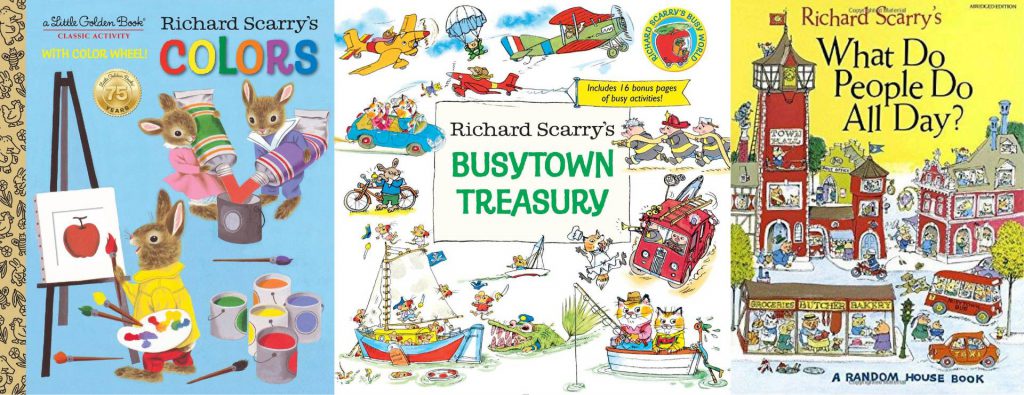
Books That Channel the Spirit of Richard Scarry
Richard Scarry is a best-loved children’s author. He illustrated over 150 books, many of which have never been out of print, and created memorable characters like Lowly Worm and Huckle Cat. For generations, Scarry has been teaching children about community helpers, concepts, and more, always encouraging imagination, learning, and exploration. If you loved Richard Scarry as a kid, we have four books for adult readers that revisit the themes and subjects of Scarry’s beloved books.
Posted by Sara Grochowski
Do You Like Green Eggs and Ham?
Happy birthday Dr. Seuss! Let's commemorate the birthday of Theodore Seuss Geisel, a.k.a. Dr. Seuss, by answering the greatest question ever posed in all of literature.
Posted by Quirk Books Staff
The Nana’s, Nannies, and Everyone in Between in Books
Every year we get to celebrate our parents with Mother’s Day and Father’s Day. But what about those awesome people who watch the kids when the parents are busy or at work? While we are happy to celebrate parents’ contributions, we would like to take a moment to appreciate those whose job is to take care of children when the parents are away. So, in honor of them, we have compiled a list of our favorite childcare providers in books.
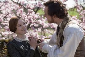
Jane Eyre from Jane Eyre by Charlotte Bronte
Posted by Sarah Fox
